Mobile App Design for daily engagement.
Platform-aware iOS and Android mobile experiences designed for ergonomic thumb reach, swift glanceability and high repeat engagement.
We design native and cross-platform mobile apps that respect Apple Human Interface Guidelines and Google Material You, featuring thumb-friendly navigation, tactile gestures, and fluid 60fps animations.
Thumb-Reach Zone
Instant Tap Transfer
PRODUCTION CAPABILITIES
Mobile App Design built for real-world use.
AKREVON brings strategic rigor, user empathy, and production-grade craftsmanship to every facet of mobile app design.

Mobile UX
Workflows structured around single-handed thumb zones, natural grip ergonomics, and context-dependent mobile usage scenarios.
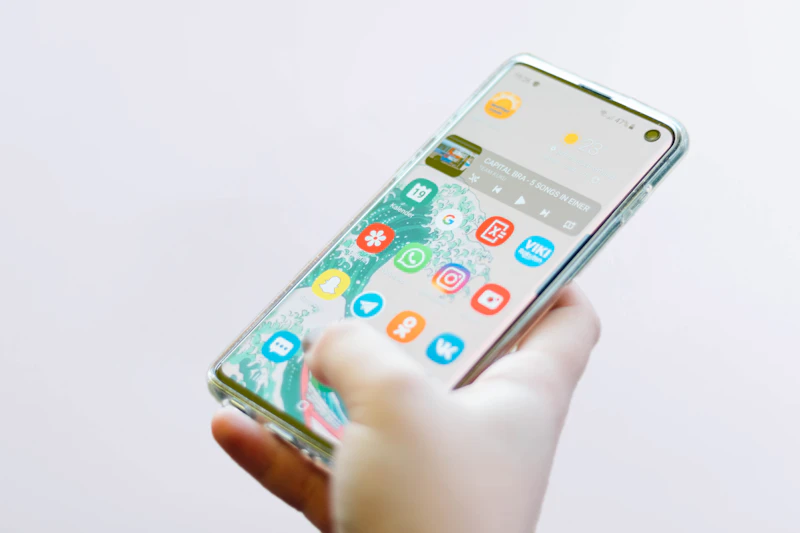
iOS & Android Design Patterns
Faithful adoption of Apple HIG and Google Material You patterns, ensuring users immediately feel familiar with navigation and controls.

Navigation Design
Intuitive mobile information architecture featuring clean tab bars, contextual sheets, master-detail views, and persistent search.
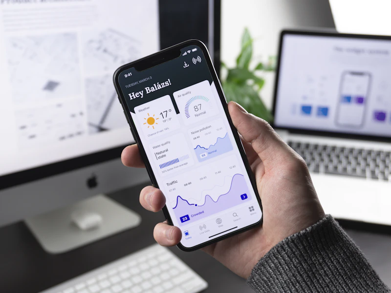
Interactive Prototypes
Realistic mobile prototypes that test and feel like native apps on physical iPhone and Android hardware before development.
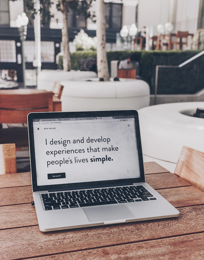
Mobile Design Systems
Component libraries structured for direct mapping into SwiftUI and Jetpack Compose, including typographic scales, spacing tokens, and dark modes.

Accessibility
Full compliance with Apple VoiceOver, Android TalkBack, Dynamic Type scaling, and high-contrast color standards for all users.
STRATEGIC DECISION FRAMEWORK
Before design begins.
Four decisions that shape the right product direction.
Native platform patterns or one shared visual language?
Balancing cross-platform brand identity with platform-specific user muscle memory.
We decide whether your mobile app should adhere strictly to native iOS and Android design conventions, or share a unified brand visual language across both. For utility and transactional apps, respecting native platform habits reduces friction; for lifestyle and consumer brands, a unified distinctive aesthetic often builds stronger brand recognition.
Which journeys must be fastest?
Optimizing high-frequency tasks for rapid, low-friction mobile completion.
Mobile users operate in short bursts under varied environmental conditions. We identify the top 2 actions users perform repeatedly (such as checking a status, scanning a QR code, or making a quick transfer) and streamline them into zero-latency, 1-tap experiences.
How should navigation work?
Structuring the primary wayfinding architecture around thumb-reach ergonomics.
We evaluate bottom tab navigation, contextual slide-over sheets, or master-detail hierarchies. Bottom navigation remains the golden standard for 3–5 core tabs, while modal sheets keep secondary flows contained without losing context.
What should be tested before development?
Validating tap accuracy, gesture intuitiveness, and glanceability on physical devices.
Before writing mobile code, we validate key interactions on physical hardware. We test whether buttons are easy to hit with one hand, whether swipe gestures conflict with system navigations, and whether typography remains legible under harsh outdoor sunlight.
DELIVERY CADENCE
How We Design Mobile Products
From thumb-reach ergonomics to native token architectures.
Context & Ergonomics
Map mobile user contexts, environmental constraints, and thumb reach zones.
Platform Wireframes
Architect low-fidelity flows respecting iOS HIG and Android Material guidelines.
Visual UI & Dark Mode
Design high-fidelity screens, micro-interactions, dynamic type, and OLED dark modes.
Device Prototype & Specs
Validate clickable flows on physical devices and export SwiftUI/Compose tokens.
Why Invest in Mobile App Design
Mobile apps compete with the best software in the world on a user's home screen.
Drive 5-Star App Store Ratings
Users reward responsive, platform-authentic apps with top reviews, directly boosting App Store organic search ranking.
Boost 30-Day Retention
Intuitive thumb-friendly workflows and delightful micro-interactions encourage habitual daily app opens.
Prevent Re-Skinning Rework
Designing with native SwiftUI and Jetpack Compose component models prevents expensive engineering rewrites.
PRODUCT OUTCOMES
Why Mobile UX Matters for Your Product
Mobile friction leads to immediate app uninstalls.
Natural Single-Handed Operation
Users navigate with effortless comfort whether walking, commuting, or multitasking.
Glanceable Information Density
Users absorb critical status information in under 2 seconds without cognitive fatigue.
Seamless System Integration
Native widgets, push notification actions, and biometric security feel deeply integrated with the OS.
THE AKREVON STANDARD
Why AKREVON for Mobile App Design
We design mobile apps that feel like first-party platform software.
Deep Platform Mastery
Our designers live and breathe Apple HIG and Google Material You specifications.
Hardware-Verified Prototypes
We test on physical devices before client presentation to ensure tap precision.
Engineered for Mobile Developers
Tokens, autolayout constraints, and assets export cleanly to SwiftUI and Jetpack Compose.
FREQUENTLY ASKED QUESTIONS
Mobile app design answers
We recommend shared brand typography, color palettes, and component aesthetics, while adapting navigation bars, back buttons, sheet behaviors, and system dialogs to conform to native platform expectations.
Ready to design a product users genuinely love?
Book a strategic discovery session with AKREVON’s product designers to map your user journeys, design systems, and rapid interactive prototypes.